5 R, JAGS, and RJAGS
Warning: This page contains a lot of HTML graphs that can be slow to load!
From the report introduction:
There are two advantages to our proposed system compared with the current workflow:
- Our system combines data from multiple sources into a statistical model that includes uncertainty using Bayesian statistics.
- The operator can interact with the internal model through Excel to conduct scenario analysis and automatically visualise the results.
— Me
This Rmarkdown-generated page will serve as proof that a fully automated proof of concept has been developed. Whether the code is sufficiently commented or not … is a different question.
5.1 Setup
configpath = '../wairakei_data/config.xlsx'
regdatapath = '../wairakei_data/data.xlsx'
extraliqregpath = "../wairakei_data/extra_liq.csv" # for regression
extradatapath = "../wairakei_data/well_pi.csv" # ts data
pipath <- "../wairakei_data/short version Generation Projection 2016.xlsx"
base_year = '2000'
prediction_date = '2017-12-01'
production_curve_wells = c('wk255', 'wk263')
tsplotwells = c("wk118", "wk216", "wk605")
decline_wells = c(production_curve_wells, "wk272", "wk86", "wk116")
base_datetime = as.POSIXct(paste(base_year, 1, 1, sep='-'))
today_datetime = as.POSIXct(prediction_date)
# theme_update(text=element_text(family="Times New Roman"))
'%ni%' <- Negate('%in%')
# for over-plotting
special_wells = c(production_curve_wells, tsplotwells, "wk86", "wk116")
use.censor = T
n_steps = 1000
censor = function(x, type) {
# Hash the facility identifier (beware of hash clashes)
if (!use.censor) {
return(x)
} else if (type=="well") {
return(paste0("w", toupper(substr(sha1(x), 1, 3))))
} else if (type=="fp") {
return(paste0("fp", toupper(substr(sha1(x), 1, 2))))
}
}5.2 Data Handling
Data is extracted and cleaned using Python in simulation.ipynb. The Python notebook is also used to generate a rudimentary config file, but some things (network connectivity) are specified manually.
R is used to:
- Read raw data and config from Excel/CSV files
- Do additional pre-processing that depends on the data available
- Censor sensitive facility names
- Create a graph structure
- Make the data into a JAGS-readable format
5.2.1 Load Data
Reads data from several spreadsheets, including PI data. PI data is special because it has not been pre-processed. It requires additional filtering and basic pre-processing.
# read in config data
configsheets = excel_sheets(configpath)
for (sheet in configsheets) {
assign(sheet, read_excel(configpath, sheet))
}
stopifnot(!anyDuplicated(well_fp_map$well)) # each well cannot map to multiple flash plants
# read in PI data
PI <- read_excel(pipath, "From PI sheet", skip=1) %>%
rename(facility = Unit,
variable = X__1,
id = X__2,
description = X__3,
code = X__4) %>%
gather(key="datechar", value="value", -c(facility, variable, id, description, code)) %>%
mutate(date = as.Date(as.numeric(datechar), origin = "1899-12-30"),
value = as.numeric(value)) %>% select(-c(datechar, id)) %>%
mutate_if(is.character, tolower) %>%
mutate(value = as.numeric(value)) %>%
drop_na(value) %>%
filter(date >= as.Date("2017-11-01"), date < as.Date(prediction_date)) %>%
filter(!str_detect(variable, "condition|calc")) %>%
filter(str_detect(facility, "wk"))
extra_liq <- PI %>%
select(facility, date, variable, value) %>%
# filter(value>1e-4) %>%
filter(str_detect(variable, "plot|phase|whp|flow")) %>%
spread(key=variable, value=value) %>%
mutate(mf = pmax(`2phase flow`, `fp14 plot flow`, `fp15 plot flow`, `flow`, na.rm=T),
whp = pmax(`fp14 plot whp`, `fp15 plot whp`, `fp16 plot whp`, `whp`, na.rm=T),
source = "PI Database") %>%
select(well=facility, date, whp, mf, source) %>%
drop_na()
# read in regression data (plus extra)
regression_df = read_excel(regdatapath) %>% mutate(source="Well Tests")
dry_df = PI %>%
filter(str_detect(facility, "wk")) %>%
select(facility, date, variable, value) %>%
# filter(value>1e-2) %>%
group_by(facility, date) %>%
spread(key=variable, value=value) %>%
select(facility, date, `ip sf`, `actual massflow`) %>%
gather(key="key", value="mf", `ip sf`, `actual massflow`) %>%
ungroup() %>%
drop_na() %>%
rename(well=facility)5.2.2 Censor names
Censor well and flash plant names using a hash algorithm. Change the flag in setup to disable.
dry_df$well = censor(dry_df$well, "well")
extra_liq$well = censor(extra_liq$well, "well")
fp_constants$fp = censor(fp_constants$fp, "fp")
fp_gen_map$fp = censor(fp_gen_map$fp, "fp")
operating_conditions$well = censor(operating_conditions$well, "well")
regression_df$well = censor(regression_df$well, "well")
well_fp_map$well = censor(well_fp_map$well, "well")
well_fp_map$fp = censor(well_fp_map$fp, "fp")
production_curve_wells = censor(production_curve_wells, "well")
special_wells = censor(special_wells, "well")
tsplotwells = censor(tsplotwells, "well")5.2.3 Preprocessing
Generate metadata, such as which wells have which data sources, and translate facility names into unique integer IDs. Also creates dummy facilities for multiple purposes.
# combine with extra
regression_df = plyr::rbind.fill(regression_df, extra_liq)
regression_df = regression_df %>%
mutate(date_numeric = as.numeric(date - base_datetime)) %>%
mutate(date_numeric=ifelse(date_numeric>0, date_numeric, NA)) # remove dates before baseline
dry_df = dry_df %>%
filter(well %ni% unique(regression_df$well)) %>%
mutate(date_numeric = as.numeric(as.POSIXct(date) - base_datetime)) %>%
mutate(date_numeric=ifelse(date_numeric>0, date_numeric, NA)) # remove dates before baseline
well_fp_map = well_fp_map %>% select(well, fp) %>% drop_na()
# today_numeric = (Sys.time() - base_datetime) %>% as.numeric()
today_numeric = (today_datetime - base_datetime) %>% as.numeric()
# assign unique facility IDs
liq_wells = unique(regression_df$well) # aka production curve wells
dry_wells = unique(dry_df$well) # aka time series wells
map_wells = unique(well_fp_map$well) # any well mapped in config
well_names = unique(c(liq_wells, dry_wells))
fp_names = c(well_fp_map$fp, fp_gen_map$fp, fp_constants$fp) %>% unique()
fluid_types = c('ip', 'lp', 'w')
gen_names = gen_constants$gen %>% unique() %>% sort()
ip_gen_names = paste(gen_names, 'ip', sep='_')
lp_gen_names = paste(gen_names, 'lp', sep='_')
w_gen_names = paste(gen_names, 'w', sep='_')
dummy_gen_names = c(ip_gen_names, lp_gen_names, w_gen_names) %>% sort()
all_names = c('DUMMY', well_names, fp_names, dummy_gen_names, gen_names)
ids = 1:length(all_names)
names(ids) = all_names
# check data quality
no_data_wells = map_wells[!map_wells %in% c(liq_wells, dry_wells)] # see which ones we're completely guessing for
no_map_wells = c(liq_wells, dry_wells)[!c(liq_wells, dry_wells) %in% map_wells]
missing = data.frame(Wells = c(paste(no_map_wells, collapse=", ")),
row.names = c("Data available but no FP"))
# print(xtable(missing, type = "latex",
# caption=paste0("Potential data quality issues. ", names(ids)[71], " is known to be not connected, and ", names(ids)[31], " has an A/B pairing with ", names(ids)[32], "."),
# label="tab:quality"),
# file = "../_media/quality.tex")
# add names in data with IDs
regression_df = regression_df %>% mutate(well_id=ids[well])
dry_df = dry_df %>% mutate(well_id=ids[well])
operating_conditions = operating_conditions %>% mutate(well_id=ids[well]) %>% rename(whp_pred=whp)
fp_constants = fp_constants %>% mutate(fp_id=ids[fp])
gen_constants = gen_constants %>% mutate(gen_id=ids[gen]) %>% select(-gen)
well_fp_map = well_fp_map %>% mutate(well_id=ids[well], fp_id=ids[fp]) %>% select(-c(well, fp))
fp_gen_map = fp_gen_map %>% mutate(fp_id=ids[fp], gen_ip_id=ids[gen_ip], gen_lp_id=ids[gen_lp], gen_w_id=ids[gen_w]) %>% select(-c(fp, gen_ip, gen_lp, gen_w))
incomplete.fps = unique(well_fp_map %>%
filter(is.na(well_id)) %>%
mutate(fp = names(ids)[fp_id]) %>%
pull(fp))5.2.4 Graph
Work out which of the (now uniquely integer-identified) facilities flows to which. Then generates a graphic to check for correctness.
# create connectivity matrix. i flows to j
# wells to FPs
v = matrix(0, nrow=length(ids), ncol=length(ids))
v[1,-1] = 1
for (i in 1:nrow(well_fp_map)) {
id_i = well_fp_map[[i, 1]]
id_j = well_fp_map[[i, 2]]
v[id_i, id_j] = 1
}
# send ip/lp/w flows to dummy gens
for (i in 1:nrow(fp_gen_map)) {
id_i = fp_gen_map[[i, 1]]
for (j in 2:ncol(fp_gen_map)) {
facility_j = names(ids)[fp_gen_map[[i, j]]]
facility_dummy_j = paste(facility_j, fluid_types[j-1], sep='_')
id_j = ids[facility_dummy_j]
if (!is.na(id_j)) {
v[id_i, id_j] = 1
}
}
}
# dummy gens to gens
for (i in 1:nrow(gen_constants)) {
id_j = gen_constants$gen_id[i]
facility_j = names(ids)[id_j]
for (fluid in fluid_types) {
facility_dummy_i = paste(facility_j, fluid, sep='_')
id_i = ids[facility_dummy_i]
v[id_i, id_j] = 1
}
}
# convert form
m = matrix(0, nrow=nrow(v), ncol=max(colSums(v)))
rownames(m) = all_names
for (i in 1:nrow(v)) {
for (j in 1:ncol(v)) {
if (v[[i, j]]==1) {
m[j, sum(m[j,]>0)+1] = i
}
}
}
flows_to = function(well) {
return(names(ids)[m[well,]][-1])
}
# generate coordinates
dummy_locs = data.frame(name='DUMMY', x=-0.1, y=0)
well_locs = data.frame(name=well_names, x=0, y=seq(1, 1/(length(well_names)-1), length.out=length(well_names)))
fp_locs = data.frame(name=fp_names, x=1, y=seq(0, 1, length.out=length(fp_names)))
gen_dummy_locs = data.frame(name=dummy_gen_names, x=2, y=seq(0, 1, length.out=length(dummy_gen_names)))
gen_locs = data.frame(name=gen_names, x=2.5, y=seq(1/11, 10/11, length.out=length(gen_names)))
locs = rbind(dummy_locs, well_locs, fp_locs, gen_dummy_locs, gen_locs)
locs$id = ids[locs$name]
locs = locs %>% arrange(id)
g = graph_from_adjacency_matrix(v) %>%
set_vertex_attr('label', value=all_names) %>%
set_vertex_attr('x', value=as.vector(locs$x)) %>%
set_vertex_attr('y', value=as.vector(locs$y)) %>%
set_vertex_attr('label.degree', value=pi) %>%
as.undirected()
V(g)$size = ifelse(V(g)$label %in% well_names, 4, 8)
V(g)$color = ifelse(V(g)$label %in% dry_wells, "red", ifelse(V(g)$label %in% no_data_wells, "grey", "orange"))
E(g)$color = "black"
E(g)[which(tail_of(g, E(g))$label=="DUMMY")]$color = "grey"
# png("../media/full_network_uncensored.png")
# # par(mar=c(0,3,0,0), family="Times")
# par(mar=c(0,3,0,0))
# plot(g, vertex.label.dist=3,
# mark.groups = list(wells=ids[well_names], fps=ids[fp_names], gens=ids[gen_names]),
# mark.col = "#DDDDDD",
# mark.border = NA)
# text(c(-1, -0.3, 0.4, 0.9), 1.15, c("Wells", "Flash plants", "Dummy gens", "Generators"), cex=1.25)
# dev.off()
plot(g, vertex.label.dist=3,
mark.groups = list(wells=ids[well_names], fps=ids[fp_names], gens=ids[gen_names]),
mark.col = "#DDDDDD",
mark.border = NA)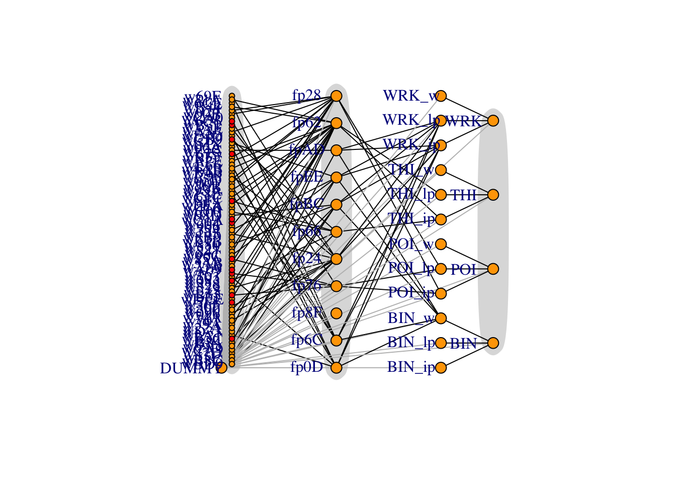
Figure 5.1: Full network diagram, with flows from left to right. Red wells indicate forecasts have been filled in from the PI data without a production curve, and dummy arcs are in grey. Dummy arcs allow IP/LP/water to be split up.
The dummy node is necessary because when indexing a subset of flows that go into a node, this subset cannot be empty. The dummy node has zero mass flowing out of it.
5.2.5 Format Data
JAGS requires data to be real numbers, vectors or matrices in a named list. It can also impute NA values from a distribution. Data wrangling is a significant part of the work - potentially more than the actual model coding and the results analysis combined.
This code also centers some of the covariates so it does not have to be done in JAGS.
\[\begin{equation} x_\text{whp} \leftarrow x_\text{whp} - \overline{x_\text{whp}} \end{equation}\]regression_list = regression_df %>% select(well_id, whp, mf, date_numeric) %>% as.list()
dry_list = dry_df %>%
filter(date < prediction_date) %>%
rename(well_id_dry=well_id, mf_dry=mf, date_numeric_dry=date_numeric) %>% # use these in a different regression
select(well_id_dry, mf_dry, date_numeric_dry) %>% as.list()
operating_conditions_list = operating_conditions %>% arrange(well_id) %>% select(whp_pred) %>% as.list()
fp_constants_list = as.list(fp_constants)
gen_constants_list = as.list(gen_constants %>% select(gen_id, factor))
facilities = data.frame(id=ids) %>%
left_join(operating_conditions %>% rename(id=well_id) %>% filter(id %in% ids) %>% select(-well), by='id') %>%
left_join(gen_constants %>% select(factor, id=gen_id), by='id') %>%
left_join(fp_constants %>% rename(id=fp_id), by='id') %>%
filter(id %in% ids) %>% # in case extras specified in data
mutate(mf_pred=NA) %>%
mutate(n_inflows=colSums(v))
well_ids = ids[well_names]
liq_well_ids = ids[liq_wells]
dry_well_ids = ids[dry_wells]
fp_ids = ids[fp_names]
ip_gen_ids = ids[ip_gen_names]
lp_gen_ids = ids[lp_gen_names]
w_gen_ids = ids[w_gen_names]
gen_ids = ids[gen_names]
# force all mass to IP steam
dry_fps = c("poi dry", "direct ip")
dry_fp_ids = ids[dry_fps]
facilities$hf_ip[facilities$id %in% dry_fp_ids] = 10
facilities$hfg_ip[facilities$id %in% dry_fp_ids] = 10
facilities_list = facilities %>% select(-id) %>% as.list()
# experimental TS data matrix for dry wells
ar_order = 1
empty = setNames(data.frame(matrix(ncol = length(all_names), nrow = 0)), all_names)
drymatrix = dry_df %>%
select(well, date_numeric, mf) %>%
spread(well, mf) %>%
select(-date_numeric)
drymatrix = empty %>%
full_join(drymatrix) %>%
as.matrix()
ar_well_ids = which(complete.cases(t(drymatrix[1:(ar_order+1),])))
ar_wells = names(ids)[ar_well_ids]
# which wells can we not use AR for
dry_no_ar_wells = dry_wells[!dry_well_ids %in% ar_well_ids]
dry_no_ar_well_ids = ids[dry_no_ar_wells]
# insert production curve predictions
stopifnot(all(tsplotwells %in% dry_df$well))
tsplotwells = ar_wells
days_since_last = as.integer(today_datetime - as.POSIXct(max(dry_df$date)))
prod = expand.grid(whp_prod=seq(6, 16, length.out=10),
well_id_prod=ids[production_curve_wells])
ts = expand.grid(date_numeric_ts=seq(min(dry_df$date_numeric), max(dry_df$date_numeric)+days_since_last, length.out=10),
well_id_ts=ids[tsplotwells])
prod_list = prod %>% as.list
ts_list = ts %>% as.list
# extend matrix for prediction
drymatrix = rbind(drymatrix, matrix(NA, nrow=days_since_last, ncol=ncol(drymatrix)))
# combine into one list
data = c(regression_list, dry_list, facilities_list, prod_list, ts_list,
list(well_ids=well_ids, liq_well_ids=liq_well_ids,
dry_well_ids=dry_well_ids, dry_no_ar_well_ids=dry_no_ar_well_ids,
fp_ids=fp_ids,
gen_ids=gen_ids, ip_gen_ids=ip_gen_ids, lp_gen_ids=lp_gen_ids, w_gen_ids=w_gen_ids,
today_numeric=today_numeric, m=m, dummy=1,
ts=drymatrix, ts_ar=drymatrix, ts_ema=drymatrix, ar_well_ids=ar_well_ids))
# data$whp_pred[is.na(data$whp_pred)] <- mean(data$whp_pred, na.rm=T)
# center covariates
mean_whp <- mean(data$whp, na.rm=T)
mean_date_numeric <- mean(data$date_numeric, na.rm=T)
data$whp_c <- data$whp - mean_whp
data$whp_pred_c <- data$whp_pred - mean_whp
data$whp_prod_c <- data$whp_prod - mean_whp
data$date_numeric_c <- data$date_numeric - mean_date_numeric
data$today_numeric_c <- data$today_numeric - mean_date_numeric
data$date_numeric_dry_c <- data$date_numeric_dry - mean_date_numeric
data$date_numeric_ts <- data$date_numeric_ts - mean_date_numeric
pidataplot = ggplot(regression_df %>% filter(source=="PI Database"), aes(x=whp, y=mf, color=well)) +
geom_point() +
labs(title=paste("PI Regression Data from", min(extra_liq$date), "to", max(extra_liq$date)),
x="Well-head pressure (bar)",
y="Mixed-phase mass flow (T/h)",
color="Well") +
guides(color=guide_legend(ncol=2))# +
# ggsave('../_media/pi_data.png', width=24.7, height=12, units='cm')
ggplotly(pidataplot)Figure 5.2: One month of the most recent regression data from the PI database. We use a combination of well test data (not shown) to estimate the regression parameters, and this PI data to increase the weight and precision for short-term forecasts. Note how PI data is tightly clustered – this forces regressions to fit closely and is desirable if our predicted regressors are close to the PI data.
5.3 Model
JAGS accepts a model in a text string. It uses an R-like syntax, but is a declarative language not sequential. We do basic manipulation of the output traces.
code = "
data {
D <- dim(ts)
}
model {
##############################################
# fit individual regressions to liquid wells #
##############################################
for (i in 1:length(mf)) {
mu[i] <- Intercept[well_id[i]] + beta_whp[well_id[i]] * whp_c[i] + beta_date[well_id[i]] * date_numeric_c[i]
mf[i] ~ dnorm(mu[i], tau[well_id[i]])
mf_fit[i] ~ dnorm(mu[i], tau[well_id[i]])
# mf_fit[i] ~ dnorm(mu[i]*measurement_error_factor[i], tau[well_id[i]])
# measurement_error_factor[i] ~ dunif(0.9, 1.1)
}
# fit regression to dry wells
for (i in 1:length(mf_dry)) {
mu_dry[i] <- Intercept[well_id_dry[i]] + beta_date[well_id_dry[i]] * date_numeric_dry_c[i]
mf_dry[i] ~ dnorm(mu_dry[i], tau[well_id_dry[i]])
mf_dry_fit[i] ~ dnorm(mu_dry[i], tau[well_id_dry[i]])
# measurement_error_factor_dry[i] ~ dunif(0.9, 1.1)
}
for (j in dry_well_ids) {
Intercept[j] ~ dnorm(0, 1e-12)
beta_date[j] ~ dnorm(0, 1e-12)
tau[j] ~ dgamma(1e-12, 1e-12)
}
# experimental AR1 model for dry wells
for (j in ar_well_ids) {
for (t in 2:D[1]) {
mu_ar[t,j] <- c_ar[j] + theta_ar[j]*ts_ar[t-1,j]
ts_ar[t,j] ~ dnorm(mu_ar[t,j], tau_ar[j]) T(0,)
}
theta_ar[j] ~ dnorm(0, 1e-12)
c_ar[j] ~ dnorm(0, 1e-12)
tau_ar[j] ~ dgamma(1e-12, 1e-12)
}
# experimental EWMA model (use at your own risk)
for (j in ar_well_ids) {
for (t in 2:D[1]) {
mu_ema[t,j] <- alpha*mu_ema[t-1,j] + (1-alpha)*ts_ema[t,j]
ts_ema[t,j] ~ dnorm(mu_ema[t-1,j], tau_ema[j]) T(0,)
}
mu_ema[1,j] <- ts_ema[1,j]
theta_ema[j] ~ dnorm(0, 1e-12)
c_ema[j] ~ dnorm(0, 1e-12)
tau_ema[j] ~ dgamma(1e-12, 1e-12)
}
alpha ~ dbeta(0.5, 0.5)
# HIERARCHICAL
# fills in for any missing wells
for (j in liq_well_ids) {
Intercept[j] ~ dnorm(mu_Intercept, tau_Intercept)
beta_whp[j] ~ dnorm(mu_beta_whp, tau_beta_whp)
# beta_whp2[j] ~ dnorm(mu_beta_whp2, tau_beta_whp2)
beta_date[j] ~ dnorm(mu_beta_date, tau_beta_date)
tau[j] ~ dgamma(1e-12, 1e-12)
sd[j] <- 1/max(sqrt(tau[j]), 1e-12)
}
# fill in any missing data
for (i in 1:length(mf)) {
date_numeric_c[i] ~ dnorm(mu_date_numeric, tau_date_numeric)
}
mu_date_numeric ~ dnorm(0, 1e-12)
tau_date_numeric ~ dnorm(1e-12, 1e-12)
# set hyperparameters
mu_Intercept ~ dnorm(0, 1e-12)
mu_beta_whp ~ dnorm(0, 1e-12)
# mu_beta_whp2 ~ dnorm(0, 1e-12)
mu_beta_date ~ dnorm(0, 1e-12)
tau_Intercept ~ dgamma(1e-12, 1e-12)
tau_beta_whp ~ dgamma(1e-12, 1e-12)
# tau_beta_whp2 ~ dgamma(1e-12, 1e-12)
tau_beta_date ~ dgamma(1e-12, 1e-12)
#####################################
# production curve for verification #
#####################################
for (i in 1:length(whp_prod)) {
mu_prod[i] <- Intercept[well_id_prod[i]] + beta_whp[well_id_prod[i]] * whp_prod_c[i] + beta_date[well_id_prod[i]] * today_numeric_c
# mf_prod[i] ~ dnorm(mu_prod[i], tau[well_id_prod[i]])
mf_prod[i] <- mu_prod[i]
}
for (i in 1:length(date_numeric_ts)) {
mu_ts[i] <- Intercept[well_id_ts[i]] + beta_date[well_id_ts[i]] * date_numeric_ts[i]
mf_ts[i] ~ dnorm(mu_ts[i], tau[well_id_ts[i]])
}
#########################################################
# simple model to fill in missing FP enthalpy constants #
#########################################################
for (i in fp_ids) {
# missing fp constants
hf_ip[i] ~ dgamma(param[1], param[7])
hg_ip[i] ~ dgamma(param[2], param[8])
hfg_ip[i] ~ dgamma(param[3], param[9])
hf_lp[i] ~ dgamma(param[4], param[10])
hg_lp[i] ~ dgamma(param[5], param[11])
hfg_lp[i] ~ dgamma(param[6], param[12])
}
for (i in c(1, well_ids)) {
h[i] ~ dgamma(param[13], param[14])
whp_pred_c[i] ~ dnorm(param[15], param[16])
} # missing well constants
for (i in 1:16) { param[i] ~ dgamma(1e-12, 1e-12) } # uniform priors
########################################
# make predictions (the stuff we want) #
########################################
mf_pred[dummy] <- 0 # dummy well
ip_sf[dummy] <- 0
lp_sf[dummy] <- 0
wf[dummy] <- 0
# use production curve
for (j in liq_well_ids) {
mf_pred[j] <- max(Intercept[j] + beta_whp[j] * whp_pred_c[j] + beta_date[j] * today_numeric_c, 0)
}
# use naive TS reg
for (j in dry_well_ids) { #dry_no_ar_well_ids) {
mf_pred[j] <- max(Intercept[j] + beta_date[j] * today_numeric_c, 0)
}
# use AR(1)
# for (j in ar_well_ids) {
# mf_pred[j] <- mu_ar[D[1], j]
# }
for (i in fp_ids) {
mf_pred[i] <- sum(mf_pred[m[i,1:n_inflows[i]]])
h[i] <- sum(mf_pred[m[i, 1:n_inflows[i]]] * h[m[i, 1:n_inflows[i]]]) / ifelse(mf_pred[i]!=0, mf_pred[i], 1)
ip_sf[i] <- min(max((h[i] - hf_ip[i]), 0) / hfg_ip[i], 1) * mf_pred[i]
lp_sf[i] <- min(max((min(hf_ip[i], h[i]) - hf_lp[i]), 0) / hfg_lp[i], 1) * (mf_pred[i] - ip_sf[i])
total_sf[i] <- ip_sf[i] + lp_sf[i]
wf[i] <- mf_pred[i] - total_sf[i]
}
# dummy gens and actual gens
for (i in ip_gen_ids) { mf_pred[i] <- sum(ip_sf[m[i, 1:n_inflows[i]]]) }
for (i in lp_gen_ids) { mf_pred[i] <- sum(lp_sf[m[i, 1:n_inflows[i]]]) }
for (i in w_gen_ids) { mf_pred[i] <- sum(wf[m[i, 1:n_inflows[i]]]) }
for (i in gen_ids) {
mf_pred[i] <- sum(mf_pred[m[i,1:n_inflows[i]]])
power[i] <- mf_pred[i] / mu_factor[i]
mu_factor[i] ~ dunif(0.95*factor[i], 1.05*factor[i]) # uncertainty from email
}
total_power <- sum(power[gen_ids])
}
"
# cat(code, file="model.txt")
vars = c('mf_fit',
'mf_dry_fit',
'mf_ts',
'mf_prod',
'mf_pred',
'beta_date',
'sd',
'power',
'total_sf',
'mu_ar',
'ts_ar',
'mu_ema',
'ts_ema',
'alpha',
'ip_sf',
'lp_sf',
'wf',
paste0('h[', fp_ids, ']'),
paste0('mu_', c('Intercept', 'beta_whp', 'beta_date')),
'total_power')
n_chains = 2
burn_in = 100
model = jags.model(textConnection(code), data, n.chains=n_chains)## Compiling data graph
## Resolving undeclared variables
## Allocating nodes
## Initializing
## Reading data back into data table
## Compiling model graph
## Resolving undeclared variables
## Allocating nodes
## Graph information:
## Observed stochastic nodes: 6257
## Unobserved stochastic nodes: 3918
## Total graph size: 29435
##
## Initializing modelupdate(model, burn_in)
out = coda.samples(model, n.iter=round(n_steps/n_chains), variable.names=vars)
outmatrix = as.matrix(out)
outframe = as.data.frame(outmatrix) %>%
gather(key=facility, value=value) %>%
mutate(variable=gsub("\\[.*$", "", facility), facility=parse_number(facility, na=c("NA")))
outframe$facility = factor(names(ids)[outframe$facility])
outframe %>% tail %>% kable(caption="A few samples.") %>% kable_styling| facility | value | variable | |
|---|---|---|---|
| 5653995 | fp8F | 0 | wf |
| 5653996 | fp8F | 0 | wf |
| 5653997 | fp8F | 0 | wf |
| 5653998 | fp8F | 0 | wf |
| 5653999 | fp8F | 0 | wf |
| 5654000 | fp8F | 0 | wf |
5.4 Convergence Tests
One of the difficulties with MCMC approximations is they often require a burn-in (warm-up) period before settling into the stationary distribution of the Markov chain. Only the stationary distribution corresponds to the joint distribution we wish to sample from. In most practical uses, there is no way to predict convergence, so we diagnose convergence by monitoring the sample trace and running diagnostic tests.
5.4.1 Trace plots
Poor convergence or mixing is indicated by a strong trend at the beginning of the trace plot.
trace1 <- outframe %>%
filter(variable=='mf_pred', facility==censor('wk256', "well")) %>%
mutate(index = 1:nrow(.))
trace2 <- outframe %>%
filter(variable=='total_power') %>%
mutate(index = 1:nrow(.))
trace3 <- outframe %>%
filter(variable=='mu_Intercept') %>%
mutate(index = 1:nrow(.))
traceplot = ggplot(trace1, aes(x=index, y=value, color=variable)) +
geom_line(alpha=0.75) +
geom_line(data=trace2, alpha=0.75) +
geom_line(data=trace3, alpha=0.75) +
coord_cartesian(xlim = c(max(trace1$index)-1000, max(trace1$index))) +
labs(title="Trace Plot (Single chain)", x="Iteration", y="Parameter value", color="Variable")# +
# ggsave('../media/trace_plot.png', width=16, height=8, units='cm')
# ggplotly(traceplot)
traceplot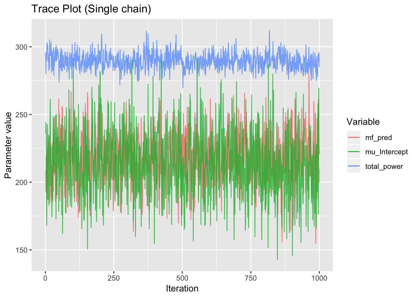
Figure 5.3: Example trace plots displaying normal behaviour. The sampler appears to have reached its equilibrium distribution with no trend.
5.4.2 Geweke
Geweke’s convergence diagnostic for MCMC samples tests for equality of the means in the first 10% and last 50% of the trace. The means will be equal if the sample is drawn from a stationary distribution, indicating the burn-in period has been successfully excluded.
If true univariate convergence has been achieved, we expect 95% of variables to pass Geweke’s test with a z-score less than 1.96 with 95% confidence.
# 100 random var because it takes too long
random_var_ix = sample.int(ncol(outmatrix), 100)
geweke.out = geweke.diag(out[,random_var_ix])
geweke.df = data.frame(Index = 1:length(unlist(geweke.out)),
z = unlist(geweke.out[1])) %>%
mutate(out = ifelse(abs(z)>1.96, T, F)) %>%
drop_na()proportion_out = sum(geweke.df$out) / nrow(geweke.df)
gewekeplot = ggplot(geweke.df, aes(x=Index, y=z)) +
geom_point() +
geom_hline(data=data.frame(value=c(1.96,-1.96)), aes(yintercept=value), color='red') +
labs(title=paste0("Geweke z-score. ", round(proportion_out, 2)*100,
"% of points lie outside the 95% confidence interval."))# +
# ggsave('../_media/geweke.png', width=24.7, height=6, units='cm')
ggplotly(gewekeplot)Figure 5.4: More than 5% of z-scores outside the confidence interval, indicating the chains have not converged and are either too short or contain burn-in.
5.4.3 Gelman
The Gelman-Rubin convergence diagnostic gives the potential scale reduction factor (PSRF) for each parameter. This requires at least two independent chains and tests whether the chains have converged to identical distributions. If the chains have not converged, the scale reduction factors will have upper confidence limits greater than one. It is possible that when run indefinitely, the variance of the parameter estimate could shrink by the PSRF.
gelman.out = gelman.diag(out[,c(paste0('mf_pred[', 8:9, ']'),
'beta_date[9]', 'mu_beta_whp', 'mu_beta_date',
'mu_Intercept', 'total_power')])[[1]] %>%
as.data.frame()
gelman.out %>% kable(caption="Gelman-Rubin test statistics") %>% kable_styling| Point est. | Upper C.I. | |
|---|---|---|
| mf_pred[8] | 1.0017218 | 1.009482 |
| mf_pred[9] | 1.0001877 | 1.003918 |
| beta_date[9] | 1.0277830 | 1.114368 |
| mu_beta_whp | 0.9999491 | 1.002421 |
| mu_beta_date | 1.0084465 | 1.016942 |
| mu_Intercept | 0.9999066 | 1.003478 |
| total_power | 1.0004981 | 1.000559 |
Some of the upper CIs are slightly greater than one, but not significantly. Large PSRFs are acceptable if they are in components of the network that do not affect parameters of interest.
5.4.4 Raftery
Raftery’s diagnostic gives the number of samples required to estimate a quantile (or credible interval) to a certain accuracy. In this notebook we only run 1000 samples so it says we do not have enough.
raftery.out = raftery.diag(out[,c(paste0('mf_pred[', 8:9, ']'),
'beta_date[9]', 'mu_beta_whp', 'mu_beta_date',
'mu_Intercept', 'total_power')])
raftery.out[[1]]##
## Quantile (q) = 0.025
## Accuracy (r) = +/- 0.005
## Probability (s) = 0.95
##
## You need a sample size of at least 3746 with these values of q, r and s5.5 Posteriors
We generate density plots in their most basic forms without post-processing.
5.5.1 Well Mass Flow
g1 = ggplot(outframe %>%
filter(facility %in% well_names, variable=="mf_pred", value>0) %>%
mutate(source = ifelse(facility %in% dry_wells, "PI time series", "Production curve")),
aes(x=value, fill=facility)) +
geom_density(aes(y=..scaled..), alpha=0.5, color=NA) + xlim(0, NA) +
facet_grid(source~.) +
theme(axis.text.y=element_blank(),
axis.ticks.y=element_blank()) +
guides(fill=F) +
labs(title=paste("Posterior Well Mass Flows for", prediction_date),
x="Mass flow (T/h)", y="Scaled density", fill="Facility")# +
# ggsave('../media/mf_wells_sans.png', width=12, height=8, units='cm')
ggplotly(g1, tooltip=c('facility', 'value'))Figure 5.5: Posterior mass flows for all 71 wells, divided into wells with production curves and wells with a simple time-series. Wells show large variations in mean mass flow and variance.
5.5.2 Decline Rate
An operator might like to see which wells are declining the fastest.
g2 = ggplot(outframe %>% filter(variable=="beta_date", facility %in% special_wells),
aes(x=value, fill=facility)) +
geom_density(alpha=0.5, color=NA) +
geom_vline(xintercept = 0, color="red") +
labs(title="Posterior Decline Rate of Test Data",
x="beta_date (T/h/d)", y="Density", fill="Facility") +
theme(axis.text.y=element_blank(),
axis.ticks.y=element_blank())# +
# guides(fill=F) +
# ggsave('../media/beta_date_sans.png', width=12, height=8, units='cm')
ggplotly(g2, tooltip=c('facility', 'value'))Figure 5.6: Decline rates for \(\beta_\text{date}\).
5.5.3 Gen Mass Flow
g4 = ggplot(outframe %>% filter(facility %in% gen_names, variable=="mf_pred", value>0),
aes(x=value, fill=facility)) +
geom_density(aes(y=..scaled..), alpha=0.5, color=NA) + xlim(0, NA) +
theme(axis.text.y=element_blank(),
axis.ticks.y=element_blank()) +
labs(title=paste("Posterior Generator Values for", prediction_date),
x="Mass flow (T/h)", y="Scaled density", fill="Facility")# +
# ggsave('../_media/mf_gens.png', width=24.7, height=10, units='cm')
ggplotly(g4, tooltip=c('facility', 'value'))Figure 5.7: Generator mass flow estimates.
5.5.4 Gen Power
g5.actual = data.frame(facility = c("WRK", "THI", "POI", "BIN"),
value = c(121.73567, 172.18096, 51.53028, 9.98687))
g5 = ggplot(outframe %>% filter(facility %in% gen_names, variable=="power", value>0),
aes(x=value, fill=facility)) +
geom_density(aes(y=..scaled..), alpha=0.5, color=NA) + xlim(0, NA) +
# geom_vline(data=g5.actual, aes(xintercept=value, color=facility)) +
theme(axis.text.y=element_blank(),
axis.ticks.y=element_blank()) +
labs(x="Power (MW)", y="Scaled density", fill="Facility")# +
# ggsave('../_media/power_gens.png', width=24.7, height=10, units='cm')
ggplotly(g5, tooltip=c('facility', 'value'))Figure 5.8: Generator power estimates
tsgrob4.5 = grid_arrange_shared_legend(g4, g5, nrow=2, ncol=1, position = "right")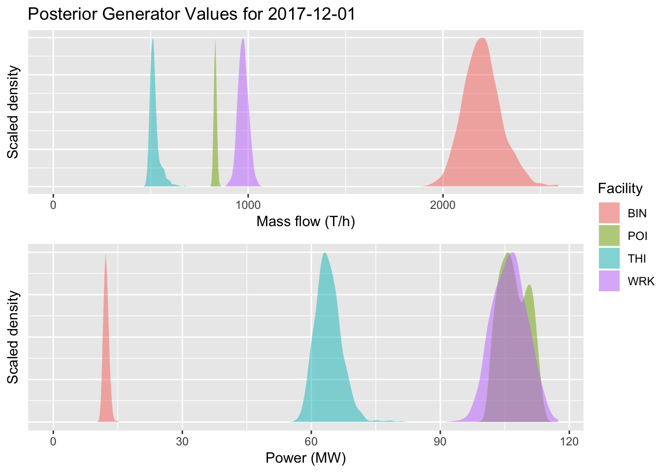
Figure 5.8: Generator power estimates
# ggsave('../media/gens_sans.png', tsgrob4.5, width=12, height=8, units='cm')5.5.5 Well Standard Deviation
tb6 <- outframe %>% filter(variable=="sd") %>% select(facility, value) %>%
mutate(well=factor(facility)) %>%
group_by(well) %>%
summarise(Mean = mean(value),
`Lower 2.5%` = quantile(value, 0.025),
`Upper 97.5%` = quantile(value, 0.975)) %>%
mutate_if(is.numeric, round, 3) %>%
inner_join(regression_df %>%
mutate(well=factor(names(ids)[well_id])) %>%
group_by(well) %>%
summarise(n=n()), by="well")
g6 = ggplot(outframe %>% filter(variable=="sd") %>% filter(facility %in% special_wells),
aes(x=value, fill=facility)) +
geom_density(alpha=0.5, color=NA) + coord_cartesian(xlim=c(0, max(tb6$`Upper 97.5%`))) +
theme(axis.text.y=element_blank(),
axis.ticks.y=element_blank()) +
labs(title="Posterior Flow Deviation Estimates",
x="Standard deviation", y="Density", fill="Facility")# +
# ggsave('../_media/standard_deviation.png', width=24.7, height=10, units='cm')
ggplotly(g6, tooltip=c('facility', 'value'))Figure 5.9: Estimates for standard deviation in well mass flow.
5.6 Advanced Analysis
5.6.1 High Variance wells
nrow.source = function(df, facilityname, sourcename) {
return(nrow(df %>% filter(well==facilityname, source==sourcename)))
}
well_summaries = outframe %>%
filter(facility %in% well_names, variable=="mf_pred") %>%
group_by(facility) %>%
summarise(mean = mean(value),
sd = sd(value),
n_test = nrow.source(regression_df, unique(facility),"Well Tests"),
n_pi = nrow.source(regression_df, unique(facility), "PI Database"),
use.test = ifelse(n_test>0, "Test data", "No test data"),
use.pi = ifelse(n_pi>0, "PI data", "No PI data")) %>%
arrange(desc(sd))
well_summaries$production.curve = ifelse(well_summaries$facility %in% liq_wells,
"Production curve", "Time series")
# fp_summaries = list(fp14 = well_summaries %>% filter(facility %in% flows_to(censor('fp14', 'fp'))),
# fp15 = well_summaries %>% filter(facility %in% flows_to(censor('fp15', 'fp'))),
# fp16 = well_summaries %>% filter(facility %in% flows_to(censor('fp16', 'fp'))))
# for (fp in names(fp_summaries)) {
# print(xtable(fp_summaries[[fp]] %>% select(-c(use.test, use.pi, production.curve)),
# type = "latex",
# caption=paste("Data methods feeding flash plant", censor(fp, 'fp')),
# label=paste0("tab:well_summaries_", fp)),
# table.placement = "H",
# file = paste0("../_media/summaries_", fp, ".tex"))
# }
n_summaries = well_summaries %>%
group_by(use.pi, use.test) %>%
count()
sourceplot = ggplot(well_summaries, aes(x=1, y=log(sd))) +
geom_boxplot(fill='steelblue') +
# geom_label(data=n_summaries,
# aes(x=-Inf, y=-Inf, hjust=0, vjust=0,
# label=paste0("n=", n), family="Times New Roman"),
# label.size=0, fill='white') +
geom_text(data=n_summaries,
aes(x=-Inf, y=-Inf, hjust=0, vjust=0,
label=paste0("n=", n), family="Times New Roman")) +
facet_grid(.~ use.pi + use.test) +
theme(axis.text.x=element_blank(),
axis.ticks.x=element_blank()) +
labs(title="Differences in Production Error by Data Source",
x="Production curve data source", y="log(standard deviation)")# +
# ggsave('../_media/error_source.png', width=24.7*0.5, height=6, units='cm')
ggplotly(sourceplot)Figure 5.10: Facets of the data sources for the mass flow’s standard deviation. No data (far left) means there was no curve – these mass flows were predicted by time series on PI mass-flow data. \(n\) is the number of wells, and standard deviation is calculated as \(\text{sd}(\hat{\dot{m}}_j)\) for each well. Lower values mean the samples for mass flow were more concentrated, but this is not necessarily a good thing if it means we are under-estimating uncertainty.
sourcetab = well_summaries %>%
select(facility, mean, sd, n_test, n_pi) %>%
mutate(error.coef = sd/mean)
# print(xtable(sourcetab %>% head(), type = "latex",
# caption="Upon inspection of the wells with the most variance, there is no immediate cause for high variance. This requires further investigation.",
# label="tab:well_summaries"),
# table.placement = "h",
# file = "../_media/well_summaries.tex")
# sourcetab %>% datatable(caption = "Production errors and data sources",
# options=list(scrollX=T))
sourcetab %>% kable(caption="Production errors and data sources") %>%
kable_styling %>% scroll_box(height="400px", width="100%")| facility | mean | sd | n_test | n_pi | error.coef |
|---|---|---|---|---|---|
| wC00 | 63.9981457 | 99.0531079 | 2 | 0 | 1.5477497 |
| wF8E | 91.7251623 | 79.1308073 | 4 | 0 | 0.8626947 |
| wCA0 | 92.3188475 | 50.0940956 | 26 | 0 | 0.5426205 |
| wC98 | 322.6368801 | 47.6007790 | 28 | 0 | 0.1475367 |
| w74A | 162.2008252 | 39.0661915 | 36 | 0 | 0.2408508 |
| w06A | 74.0340774 | 26.6859815 | 10 | 0 | 0.3604554 |
| w354 | 63.9002997 | 26.3140532 | 24 | 0 | 0.4117986 |
| w416 | 99.5325350 | 26.0573663 | 31 | 0 | 0.2617975 |
| wB84 | 111.3918407 | 25.1605822 | 13 | 0 | 0.2258746 |
| w518 | 185.0984037 | 22.5775834 | 31 | 0 | 0.1219761 |
| wF4C | 123.1824162 | 21.8411400 | 31 | 0 | 0.1773073 |
| wE66 | 28.6914173 | 21.4476007 | 10 | 0 | 0.7475267 |
| w69D | 154.3584804 | 20.5179189 | 26 | 0 | 0.1329238 |
| w390 | 127.8122133 | 19.6294856 | 32 | 0 | 0.1535807 |
| w55E | 94.2931147 | 19.6032300 | 26 | 0 | 0.2078967 |
| wC1C | 218.3968326 | 18.3982077 | 32 | 30 | 0.0842421 |
| wA2E | 87.9092983 | 18.2419519 | 27 | 30 | 0.2075088 |
| w906 | 322.9491506 | 16.4306409 | 29 | 30 | 0.0508769 |
| w3AE | 393.2207197 | 15.8516454 | 34 | 30 | 0.0403123 |
| w096 | 420.6752761 | 15.3806557 | 41 | 30 | 0.0365618 |
| w30F | 334.8851488 | 14.7214381 | 34 | 30 | 0.0439597 |
| wE1B | 118.6753231 | 14.5747640 | 16 | 0 | 0.1228121 |
| w93A | 377.6639378 | 14.0461418 | 41 | 30 | 0.0371922 |
| wB8C | 132.7815690 | 13.4422456 | 26 | 0 | 0.1012358 |
| w31A | 305.7295697 | 13.1307510 | 31 | 30 | 0.0429489 |
| w70B | 157.5224458 | 12.0554308 | 26 | 0 | 0.0765315 |
| w328 | 132.4247509 | 11.8561516 | 25 | 30 | 0.0895312 |
| w96C | 62.6956628 | 10.7038158 | 47 | 0 | 0.1707266 |
| w880 | 152.2787464 | 10.4818345 | 45 | 0 | 0.0688332 |
| w05D | 634.5382017 | 9.8903755 | 36 | 30 | 0.0155867 |
| w6CE | 205.9843676 | 9.8516171 | 20 | 0 | 0.0478270 |
| w39A | 196.6249909 | 9.6842463 | 37 | 30 | 0.0492524 |
| w2A1 | 202.3288276 | 9.5404853 | 92 | 0 | 0.0471534 |
| w08D | 252.7168867 | 9.4331129 | 31 | 0 | 0.0373268 |
| w69F | 107.0533518 | 8.7552678 | 44 | 0 | 0.0817842 |
| w47D | 375.6029229 | 8.6025506 | 52 | 30 | 0.0229033 |
| w4AB | 7.5881982 | 7.6685007 | 0 | 30 | 1.0105825 |
| w024 | 85.6494318 | 6.8252907 | 6 | 30 | 0.0796887 |
| wB4B | 149.2741061 | 6.7212862 | 18 | 0 | 0.0450265 |
| wDEE | 232.9507090 | 6.3186185 | 48 | 30 | 0.0271243 |
| wE4D | 132.7990085 | 5.8186998 | 18 | 0 | 0.0438158 |
| w503 | 44.3078482 | 5.6931302 | 18 | 0 | 0.1284903 |
| wA37 | 295.9185023 | 4.9354244 | 33 | 30 | 0.0166783 |
| wBE7 | 250.1393053 | 4.8871555 | 37 | 30 | 0.0195377 |
| w00B | 269.6026030 | 4.5148820 | 32 | 30 | 0.0167464 |
| w847 | 461.7868877 | 4.3236383 | 5 | 30 | 0.0093628 |
| w3AB | 198.6393599 | 3.5121365 | 38 | 30 | 0.0176810 |
| w521 | 309.2015985 | 3.2274131 | 37 | 30 | 0.0104379 |
| w145 | 221.4903843 | 3.1958085 | 34 | 30 | 0.0144287 |
| wCA9 | 207.5767543 | 2.6306717 | 7 | 30 | 0.0126732 |
| w001 | 226.6452359 | 2.3592042 | 39 | 30 | 0.0104092 |
| w167 | 34.9986266 | 1.6260144 | 0 | 0 | 0.0464594 |
| wBD9 | 14.4652592 | 0.9671309 | 0 | 30 | 0.0668589 |
| w85A | 21.8041081 | 0.8425673 | 0 | 0 | 0.0386426 |
| w529 | 13.1189572 | 0.5331816 | 0 | 30 | 0.0406421 |
| wFEA | 60.3061260 | 0.4627170 | 0 | 30 | 0.0076728 |
| wE15 | 45.5548760 | 0.4221435 | 0 | 30 | 0.0092667 |
| w5F8 | 1.3259438 | 0.3815764 | 0 | 0 | 0.2877772 |
| wB55 | 6.8469432 | 0.3056685 | 0 | 0 | 0.0446431 |
| wA09 | 1.6093490 | 0.2899152 | 0 | 0 | 0.1801444 |
| wB44 | 30.8431955 | 0.2091660 | 0 | 30 | 0.0067816 |
| w8F4 | 6.6804815 | 0.1841890 | 0 | 0 | 0.0275712 |
| w8B9 | 22.6098826 | 0.1777644 | 0 | 30 | 0.0078622 |
| w23A | 23.3865492 | 0.1576293 | 0 | 30 | 0.0067402 |
| wD33 | 0.1544295 | 0.1394357 | 0 | 30 | 0.9029088 |
| w701 | 14.9971632 | 0.1082694 | 0 | 30 | 0.0072193 |
| wCB9 | 26.3655839 | 0.0857350 | 0 | 0 | 0.0032518 |
| w083 | 8.1267305 | 0.0836531 | 0 | 0 | 0.0102936 |
| w22A | 58.8893110 | 0.0676537 | 0 | 30 | 0.0011488 |
| w6C6 | 0.7690489 | 0.0396560 | 0 | 0 | 0.0515650 |
| wB3C | 9.5086399 | 0.0318312 | 0 | 0 | 0.0033476 |
| w675 | 0.0019461 | 0.0019686 | 0 | 0 | 1.0115735 |
| wB31 | 0.0012408 | 0.0012583 | 0 | 0 | 1.0140403 |
| wC1A | 0.0006930 | 0.0004405 | 0 | 0 | 0.6357041 |
| w204 | 0.0000000 | 0.0000000 | 0 | 0 | NaN |
5.6.2 Regression Fits
prod = as.data.frame(outmatrix) %>%
select(contains('prod')) %>%
gather(key=facility, value=value) %>%
mutate(which=parse_number(facility)) %>%
mutate(whp=data$whp_prod[which],
well = names(ids)[data$well_id_prod[which]]) %>%
rename(mf=value) %>%
group_by(well, whp) %>%
summarise(lower=quantile(mf, 0.025),
upper=quantile(mf, 0.975),
mean=mean(mf))
plotdata = regression_df %>%
filter(well_id %in% ids[production_curve_wells]) %>%
mutate(datetime = factor(as.Date(date))) %>%
mutate(source = factor(source, levels=c("Well Tests", "PI Database")))
# regression plot
regplot = ggplot(prod, aes(x=whp)) +
geom_line(aes(y=mean, color=well)) +
geom_ribbon(aes(ymin=lower, ymax=upper, fill=well), alpha=0.25) +
geom_point(data=plotdata, aes(y=mf, color=well, size=date, shape=source), alpha=0.5) +
labs(title="Linear Regression on Test and PI Data",
x="Well-head pressure (bar)", y="Mass flow (T/h)",
color="Well", shape="Data source", size="Date", fill="Well") +
coord_cartesian(xlim=c(min(plotdata$whp)*0.9,max(plotdata$whp)*1.1),
ylim=c(0,max(plotdata$mf)*1.1))# +
# ggsave('../_media/production_curve.png', width=24.7*0.48, height=24.7*0.48, units='cm')
ggplotly(regplot)Figure 5.11: We expect the curves to make better predictions near the PI data after inclusion. Forecasted production curves for December 1st, and shaded regions are 95% credible intervals.
saveWidget(ggplotly(regplot), "regplot.html")5.6.3 Time Series Plots
tsplotwells = ar_wells
ts_fit = as.data.frame(outmatrix) %>%
select(contains('mf_ts')) %>%
gather() %>%
mutate(index = parse_number(key)) %>% select(-key) %>%
group_by(index) %>%
summarise(lower=quantile(value, 0.025),
upper=quantile(value, 0.975),
mean=mean(value)) %>%
cbind(ts) %>%
mutate(well = factor(names(ids[well_id_ts])),
date_numeric = date_numeric_ts)
# actual observations
tsplotdata = dry_df %>%
filter(well_id %in% ids[tsplotwells]) %>%
mutate(datetime = factor(as.Date(date)),
facility = well)
# experimental AR1 time series
ar_fit = as.data.frame(outmatrix) %>%
select(contains("mu_ar")) %>%
gather() %>%
mutate(date_numeric = as.numeric(str_extract(key, "(?<=\\[)(.*?)(?=,)")) + min(dry_df$date_numeric) - 1,
facility = names(ids)[as.numeric(str_extract(key, "(?<=,)(.*?)(?=\\])"))]) %>%
select(facility, date_numeric, value) %>%
group_by(facility, date_numeric) %>%
summarise(mean=mean(value),
lower=quantile(value, 0.025),
upper=quantile(value, 0.975)) %>%
filter(facility %in% tsplotwells)
# experimental EMA time series
ewma_fit = as.data.frame(outmatrix) %>%
select(contains("mu_ema")) %>%
gather() %>%
mutate(date_numeric = as.numeric(str_extract(key, "(?<=\\[)(.*?)(?=,)")) +
min(dry_df$date_numeric) - 1,
facility = names(ids)[as.numeric(str_extract(key, "(?<=,)(.*?)(?=\\])"))]) %>%
select(facility, date_numeric, value) %>%
group_by(facility, date_numeric) %>%
summarise(mean=mean(value),
lower=quantile(value, 0.025),
upper=quantile(value, 0.975)) %>%
filter(facility %in% tsplotwells)
# find plot limits
tsmax = max(c(ts_fit$upper, ar_fit$upper, ewma_fit$upper))lintsplot = ggplot(ts_fit, aes(x=date_numeric, color=well, fill=well)) +
geom_line(aes(y=mean), linetype="dashed") +
geom_ribbon(aes(ymin=lower, ymax=upper), color=NA, alpha=0.25) +
geom_line(data=tsplotdata, aes(y=mf)) +
geom_vline(aes(xintercept = max(tsplotdata$date_numeric)),
linetype="dashed", color="red") +
coord_cartesian(ylim=c(0, 60)) +
labs(title=paste("Linear Time Series Regression for Selected Wells in PI"),
x="Days since baseline (2000)", linetype="")# +
# ggsave('../_media/dry_time_series.png', width=24.7, height=8, units='cm')
ggplotly(lintsplot)Figure 5.12: Linear regression.
saveWidget(ggplotly(lintsplot), "lintsplot.html")arplot = ggplot(ar_fit %>% filter(facility %in% tsplotwells),
aes(x=date_numeric, y=mean, fill=facility, color=facility)) +
geom_line(data=tsplotdata, aes(y=mf)) +
geom_ribbon(aes(ymin=lower, ymax=upper), color=NA, alpha=0.5) +
geom_line(linetype="dashed") + coord_cartesian(ylim=c(0, 60)) +
geom_vline(aes(xintercept = max(tsplotdata$date_numeric)),
linetype="dashed", color="red") +
labs(title="AR(1) Experiment", x="Days since first date", y="Mass flow (T/h)")# +
# ggsave('../_media/ar_experiment.png', width=24.7, height=8, units='cm')
ggplotly(arplot)Figure 5.13: First-order autoregressive model.
ewmaplot = ggplot(ewma_fit, aes(x=date_numeric, y=mean, fill=facility, color=facility)) +
geom_line(data=tsplotdata, aes(y=mf)) +
geom_ribbon(aes(ymin=lower, ymax=upper), color=NA, alpha=0.5) +
geom_line(linetype="dashed") + coord_cartesian(ylim=c(0, 60)) +
geom_vline(aes(xintercept = max(tsplotdata$date_numeric)),
linetype="dashed", color="red") +
labs(title="EWMA Experiment", x="Days since first date")# +
# ggsave('../_media/ewma_experiment.png', width=24.7, height=8, units='cm')
ggplotly(ewmaplot)Figure 5.14: Exponentially-weighted moving average model.
We use the linear time series regression (top) for its robustness to systematic changes in operation, which can cause the other regressions to display unstable behaviour. Auto-regression and exponentially-weighted moving average techniques both have their strengths and weaknesses.
5.6.4 Goodness of fit (OLS regression)
liq_fit = as.data.frame(outmatrix) %>%
select(contains('mf_fit')) %>%
gather(key='index', value='fitted') %>%
mutate(index=as.integer(parse_number(index))) %>%
group_by(index) %>%
summarise(lower=quantile(fitted, 0.025),
upper=quantile(fitted, 0.975),
Fitted=mean(fitted),
std=sd(fitted)) %>%
cbind(regression_df) %>%
mutate(`Standardised residual` = (Fitted-mf)/std,
Well = factor(names(ids[well_id])),
Observed = mf) %>%
gather(key="key", value="value", `Standardised residual`, Observed) %>%
select(Well, key, Fitted, value, source)
diagplot = ggplot(liq_fit, aes(x=Fitted, y=value)) +
geom_point(aes(color=Well, shape=Well)) +
scale_shape_manual(values = rep_len(1:25, length(unique(liq_fit$Well)))) +
geom_smooth(color='black') +
facet_wrap(~key, scales="free") +
geom_hline(data=data.frame(key="Standardised residual", value=c(1.96,-1.96)),
aes(yintercept=value), color='red') +
geom_abline(data=data.frame(key="Observed", a = 1, b = 0),
aes(slope = a, intercept=b), color='red') +
# coord_cartesian(ylim=c(-4, 4)) +
labs(title="Diagnostic Plots", x="Fitted mass flow (T/h)", y="") +
theme(legend.position = "bottom") +
guides(color=guide_legend(nrow=3, byrow=T), shape=guide_legend(nrow=3, byrow=T))# +
# ggsave('../_media/diagnostics.png', width=24.7, height=12, units='cm')
diagplot## `geom_smooth()` using method = 'gam' and formula 'y ~ s(x, bs = "cs")'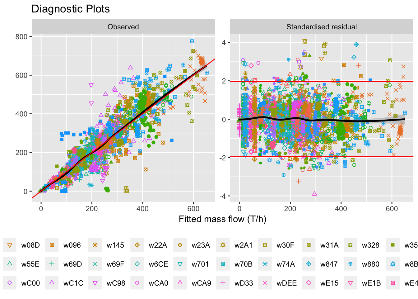
Figure 5.15: Diagnostic plots with all wells together.
selectwells = liq_fit %>% group_by(Well, key) %>%
summarise(fittedsd = sd(Fitted)) %>%
arrange(desc(fittedsd)) %>%
head(48*2) %>%
pull(Well)observedplot = ggplot(liq_fit %>% filter(key=="Observed", Well %in% selectwells),
aes(x=Fitted, y=value)) +
geom_point(aes(color=source), alpha=0.5) +
geom_smooth(color=NA, alpha=0.5) +
facet_wrap(~Well, scales="free") +
geom_abline(data=data.frame(key="Observed", a = 1, b = 0),
aes(slope = a, intercept=b)) +
labs(title="Linear Regression Fit Plots Per Well",
x="Fitted mass flow (T/h)", y="Observed mass flow (T/h)", color="Data source") +
theme(legend.position = "bottom")# +
# guides(color=guide_legend(nrow=3, byrow=T), shape=guide_legend(nrow=3, byrow=T)) +
# ggsave('../_media/observed.png', width=24.7, height=24.7, units='cm')
observedplot## `geom_smooth()` using method = 'loess' and formula 'y ~ x'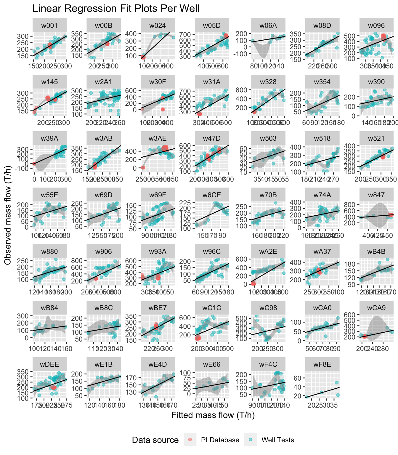
Figure 5.16: Observed vs. fitted for individual wells
stdresplot = ggplot(liq_fit %>% filter(key=="Standardised residual",
Well %in% selectwells),
aes(x=Fitted, y=value)) +
geom_point(aes(color=source), alpha=0.5) +
geom_smooth(color=NA, alpha=0.5) +
facet_wrap(~Well, scales="free_x") +
geom_hline(data=data.frame(key="Standardised residual", value=c(1.96,-1.96)),
aes(yintercept=value), color='red') +
# geom_abline(data=data.frame(key="Observed", a = 1, b = 0), aes(slope = a, intercept=b), color='red') +
labs(title="Linear Regression Residual Plots Per Well",
x="Fitted mass flow (T/h)", y="Standardised residual", color="Data source") +
coord_cartesian(ylim=c(-5, 5)) +
theme(legend.position="bottom",
axis.text.x=element_blank(),
axis.ticks.x=element_blank(),
axis.text.y=element_blank(),
axis.ticks.y=element_blank())# +
# guides(color=guide_legend(nrow=3, byrow=T), shape=guide_legend(nrow=3, byrow=T)) +
# ggsave('../media/stdres_sans.png', width=18, height=12, units='cm')
stdresplot## `geom_smooth()` using method = 'loess' and formula 'y ~ x'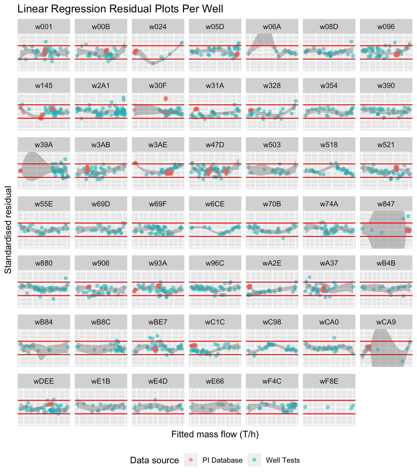
Figure 5.17: Standardised residuals for individual wells
5.6.5 Limits and Constraint Violations
sf.df <- outframe %>%
filter(str_detect(variable, "total_sf") & value > 0) %>%
droplevels()
limits = fp_constants %>%
mutate(facility = names(ids)[fp_id]) %>%
select(facility, limit) %>%
drop_na()
p.limits = sf.df %>%
left_join(limits, by=c("facility")) %>%
mutate(greater = value > limit) %>%
group_by(facility) %>%
summarise(p.greater = mean(greater)) %>%
drop_na()
limitplot = ggplot(sf.df %>% filter(facility %ni% incomplete.fps),
aes(x=value, fill=facility)) +
facet_wrap(~facility, scales = "free_y", ncol=2) +
geom_density(alpha=0.5, color=NA) +
geom_vline(data=limits, aes(xintercept=limit), color="red") +
geom_label(data=p.limits %>% filter(facility %ni% incomplete.fps),
aes(x=-Inf, y=Inf, hjust=0, vjust=1,
label=paste0("p(>lim)=", p.greater), family="Times New Roman"),
color="black", label.size=0, fill='white') +
theme(legend.position="none",
axis.text.y=element_blank(),
axis.ticks.y=element_blank()) +
labs(title="Posterior Flash Plant Mass Flows",
x="Steam flow (T/h)", y="Density", fill="Flash plant", color="Steam flow limit")# +
# ggsave('../_media/constraints.png', width=24.7, height=10, units='cm')
limitplot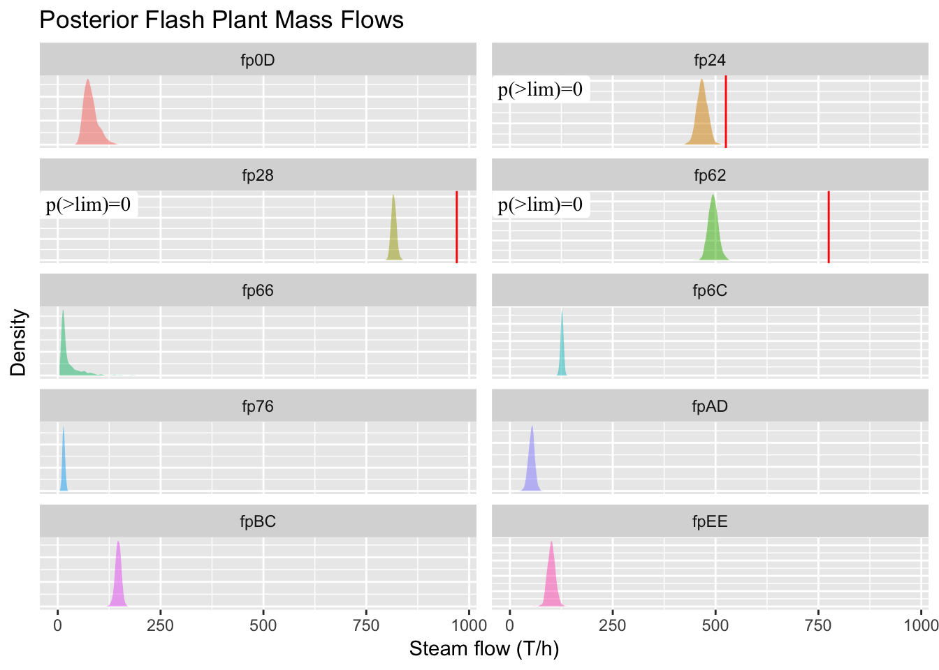
Figure 5.18: We expect the curves to make better predictions near the PI data after inclusion. Forecasted production curves for December 1st, and shaded regions are 95% credible intervals.
The following plot is for the presentation, focusing on the three FPs that feed from configurable wells.
sf.df2 <- sf.df %>%
filter(facility %in% p.limits$facility)
limitplot2 = ggplot(sf.df2, aes(x=value, fill=facility)) +
facet_wrap(~facility, scales = "free_y", ncol=1) +
geom_density(alpha=0.5, color=NA) +
geom_vline(data=limits, aes(xintercept=limit), color="red") +
# geom_label(data=p.limits %>% filter(facility %ni% incomplete.fps),
# aes(x=-Inf, y=Inf, hjust=0, vjust=1,
# label=paste0("p(>lim)=", p.greater), family="Times New Roman"),
# color="black", label.size=0, fill='white') +
xlim(0, NA) +
theme(legend.position="none",
axis.text.y=element_blank(),
axis.ticks.y=element_blank()) +
labs(title="Posterior Flash Plant Mass Flows",
x="Steam flow (T/h)", y="Density", fill="Flash plant", color="Steam flow limit")# +
# ggsave('../media/constraints2.png', width=16, height=9, units='cm')
ggplotly(limitplot2)Figure 5.19: Limit comparison for three FPs with flow limits.
saveWidget(ggplotly(limitplot2), "limitplot.html")5.6.6 Flow Comparison
flow.df <- outframe %>%
filter(facility %in% fp_names) %>%
filter(str_detect(variable, "mf_pred|ip_sf|lp_sf|wf") & value > 0) %>%
mutate(variable=ifelse(variable=="mf_pred", "mf", variable),
variable=factor(variable, levels=c("mf", "ip_sf", "lp_sf", "wf")))
comparison = fp_constants %>% select("fp", contains("verification")) %>%
rename(facility=fp) %>%
gather(key="variable", value="value", -facility) %>%
mutate(variable = gsub("^verification_", "", variable),
variable=factor(variable, levels=c("mf", "ip_sf", "lp_sf", "wf"))) %>%
drop_na()
ps = flow.df %>%
left_join(comparison, by=c("facility", "variable")) %>%
mutate(greater = value.x > value.y) %>%
group_by(facility, variable) %>%
summarise(p.greater = mean(greater)) %>%
mutate(variable=factor(variable, levels=c("mf", "ip_sf", "lp_sf", "wf"))) %>%
drop_na()
verificationplot = ggplot(flow.df %>% filter(facility %ni% incomplete.fps,
variable %in% c("mf", "lp_sf", "wf")),
aes(x=value)) +
geom_density(aes(y=..scaled.., fill=variable, color=variable),
alpha=0.5, show.legend=F) +
geom_vline(data=comparison %>% filter(facility %ni% incomplete.fps,
variable %in% c("mf", "lp_sf", "wf")),
aes(xintercept=value)) +
# geom_label(data=ps %>% filter(facility %ni% incomplete.fps),
# aes(x=-Inf, y=Inf, hjust=0, vjust=1, label=paste0("p(>x)=", p.greater),
# family="Times New Roman"), label.size=0) +
facet_grid(facility~variable, scales="free", space="free_y") +
theme(axis.text.y=element_blank(), axis.ticks.y=element_blank()) +
labs(title="Comparison Between Predicted FP Flows and Sample Data",
x="Value", y="Scaled density")# +
# ggsave('../media/verification_sans.png', width=18, height=12, units='cm')
verificationplot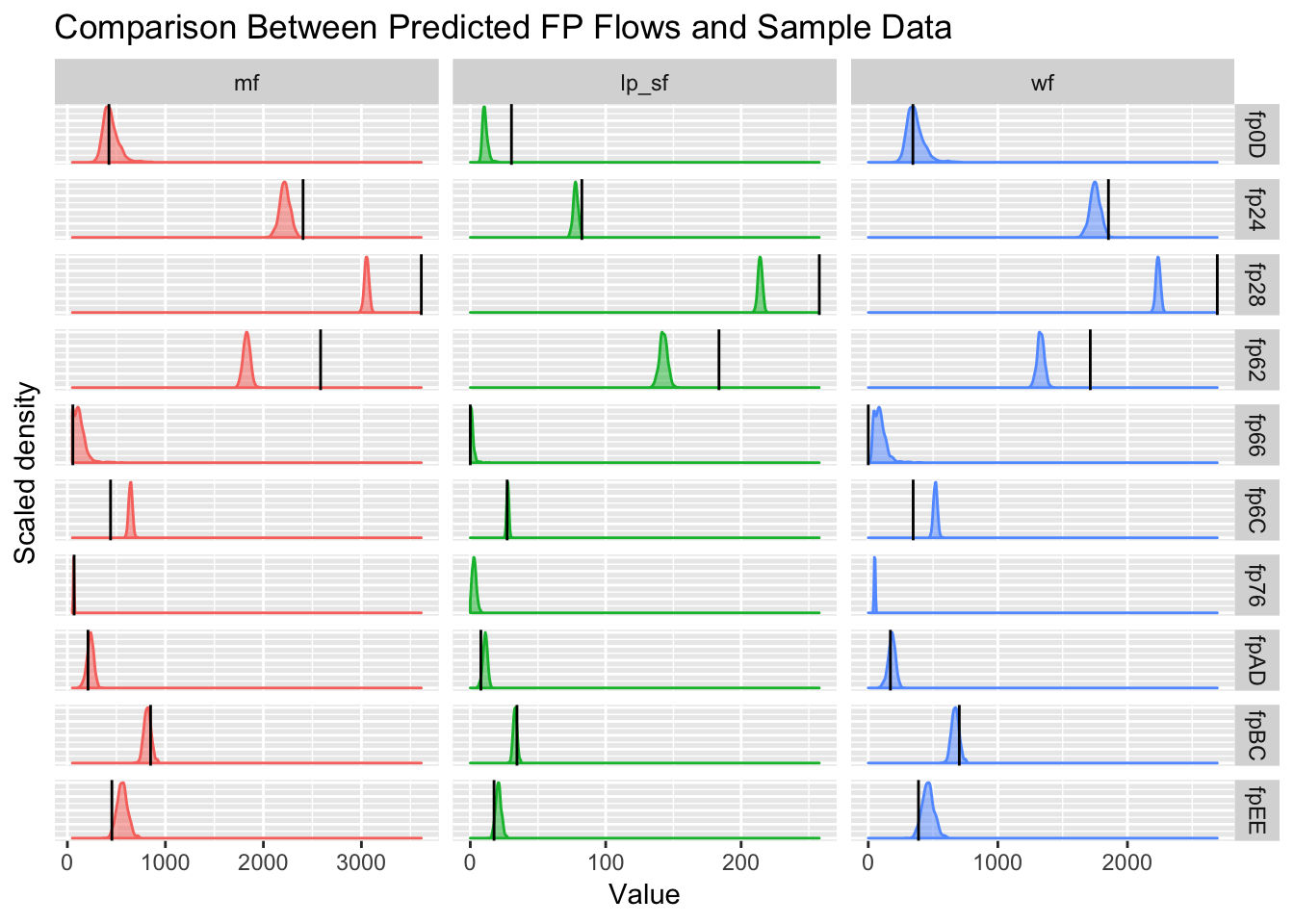
Figure 5.20: Verification of predicted flows with supplied calculations shows some disagreement (\(p<0.025\) or \(p>0.975\)), if we assume CEL’s figures as the ground truth. Densities are the model’s forecasts and black lines are the given figures from CEL (estimated by CEL, not direct from the PI loggers).