3 Initial Plots
Contact gave us a spreadsheet of the test data, including a series of plots for each well. The spreadsheet is not included here, but we recreated it in R to ensure we understood how the spreadsheet analysis worked.
3.1 Production Curves
plotdata = regression.df %>%
  mutate(date_numeric = as.numeric(date - base_datetime)) %>%
  mutate(date_numeric=ifelse(date_numeric>0, date_numeric, NA)) %>%
  mutate(datetime = factor(as.Date(date))) %>%
  group_by(round(date_numeric,-2)) %>%
  filter(n()>2) %>%
  mutate(mf2 = mf^2)

mylm = lm(mf2 ~ datetime * I(whp^2) + datetime +0, data=plotdata)
datetime = plotdata$datetime %>% unique()
whp = seq(0, 16, 0.01)
reglines = expand.grid(datetime=datetime, whp=whp)
reglines$mf2 <- unname(predict(mylm, reglines))
reglines$mf <- sqrt(reglines$mf2)
reglines$date = as.POSIXct(reglines$datetime)

shifts = as.vector(mylm$coefficients[1:6])

curveplot = ggplot(plotdata, aes(x=whp, y=mf, color=date)) +
  geom_point() +
  # ggtitle('Production Curves from Multiple Bore Tests (10.7 bar)') +
  xlab('Well-head pressure (bar)') + ylab('Mass flow (T/h)') +
  xlim(c(0, NA)) + ylim(c(0, NA)) +
  guides(color=F) +
  geom_line(data=reglines, aes(linetype=datetime)) +
  labs(color="Date", linetype="Fitted curve") +
  ggsave("../media/wk261_production.png", width=8, height=8, units='cm')
ggplotly(curveplot)
Figure 3.1: Contact’s current production curve modelling method.
saveWidget(ggplotly(curveplot), "curveplot.html")They fit an independent curve for each series of bore tests with at least three data points. We think we can do one better by treating time as a variable rather than fitting separate models. This will allow us to consider all of the data even if there was only a single test (e.g., tracer flow tests), and reduce the impact of outliers.
3.2 Decline
Then, we can estimate the decline rate of each well. Currently, Contact takes one point from each curve at a standard well-head pressure.
decay = reglines %>%
  filter(abs(whp-10.7) < 1e-3) %>%
  mutate(Method="Contact") %>%
  select(date, mf, Method) %>%
  rbind(WK_fit %>% mutate(Method="Multiple GLM"))

decayplot = ggplot(decay, aes(x=date, y=mf, color=Method)) +
  geom_point() +
  geom_smooth(method="lm") +
  facet_grid(~Method) +
  labs(title="Estimated Well Decay at 10.7 Bar", x="Date", y="Standardised mass flow", color="Data")
decayplot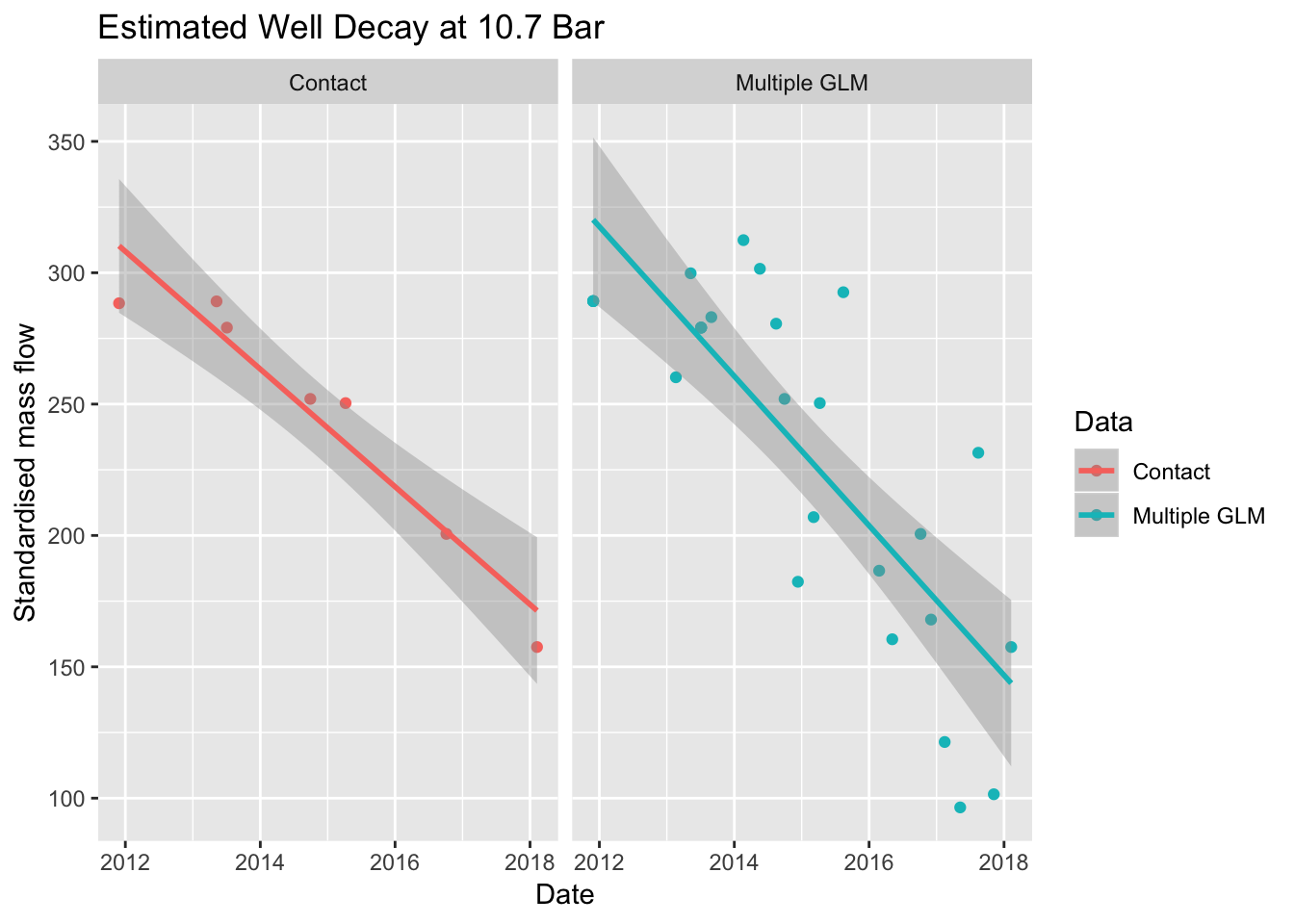
Figure 3.2: Comparison of independent curves and multiple curves.
This plot shows that the two methods give different slopes, or decay rates. Therefore, by excluding some of the data, it is possible that Contact is losing some performance in their model.